gFiber Unveils Refreshed Brand Identity
Key Highlights
-
gFiber has introduced a new visual identity featuring an updated logo, typography, and a teal, fuchsia, gold, and orange color palette.
-
The refreshed branding is rolling out across gFiber’s digital platforms, community spaces, and service operations in all of its markets.
-
gFiber says the brand update does not change its focus on speed, reliability, customer experience, and continued innovation.
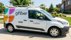
gFiber has announced a refreshed brand identity that includes an updated logo, new typography, and a color palette featuring teal, fuchsia, gold, and orange. The updated visual identity began rolling out across the company’s markets on September 15, 2026.
“A brand is more than a collection of colors and logos—it’s the way we show up for our customers every day,” said Dinni Jain, CEO of gFiber. “We’re excited to share our new look, but our core values stay the same: uncompromising standards for speed and reliability, phenomenal customer experience, and continuous innovation.”
According to gFiber, the refreshed visual identity is intended to represent the company’s existing focus on network performance, customer experience, and ongoing product and service development. The company said its updated branding does not change its underlying business principles.

Source: gFiber
Stay Connected with ISE Magazine
Subscribe to our newsletters and magazine for the latest telecom insights, explore the current issue for in-depth features and strategies, and register for upcoming webinars to learn directly from industry leaders.